

In today’s World Wide Web era, your website plays matchmaker between your business and potential customers. It’s essentially your brand’s Tinder profile – swipe right material or a quick left-dismissal. Since today we’ve all got the attention span of a caffeinated squirrel, the pressure is on to woo visitors with captivating charm or, in a cruel twist, leave them swiping away in frustration. Online interactions shape the first impression customers have of your business and your website serves as its virtual face. So, we need to talk about the six things that annoy your customers about your website. In the end, we want to craft a user experience so delightful users might want to put a ring on it… ahem… I mean bookmark it.
1. Opaque Pricing Structures
Imagine that you’ve been scouring the Internet looking for the product or solution that fits your needs as well as Cinderella’s slipper. Then, like a mirage in the desert, you spot it – something that promises to be everything you’ve been searching for. You’ve got your credit card in hand, ready to bask in the glory of modern e-commerce. But wait, what’s this? The price is nowhere to be found. No digits, no dollar signs, just an empty space staring back at you.
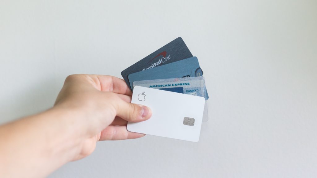
Instead of a clear, upfront cost, you’re faced with a wall – a barrier that requires you to either initiate a phone call, send an email inquiry, or commit to a tête-à-tête with a salesperson to simply get a quote. This opacity in pricing not only frustrates users but also burns precious time, leaving potential customers feeling like they’ve been led on a wild goose chase.
Now, let’s address the caveat – there are cases where a “large ticket item” or a service that requires intricate customization might necessitate a personalized consultation. It’s understandable that some solutions are more complex and require a tailored approach. But, and this is a big but, if this is the case for your offerings, don’t leave users in the dark. Make sure that it’s clear why they need to contact you.
2. Difficulty in Contacting You

Your website is the modern marketplace, a digital hub where potential customers come seeking solutions, insights, or even just a simple conversation. But when your contact information plays a game of hide-and-seek, you’re essentially locking the doors to your virtual storefront. It’s like leaving your shop unattended while customers mill about, looking for someone to assist them. Accessibility is KING. Place your contact information in a prominent spot – be it the banner, header, or footer.
We need to address the dreaded contact page, that elusive island tucked away in the corners of websites. Embed contact options where they naturally occur, and make them easily – keyword, “easily”, findable on every page of your website. Don’t even get me started on forms. They’re a necessary evil, right? Wrong. It’s cumbersome and time-consuming. Instead, allow them to engage with you just as they would in a face-to-face conversation – spontaneously and effortlessly. The less friction, the better the experience.
3. Unclear Process for Engagement
When users land on your website, they should feel as if they’ve just been handed a map that a toddler can read. Whether they’re looking to purchase your products, enlist your services, or embark on a collaborative venture, the process should be as evident as a full moon in the sky. Think of it this way: You wouldn’t invite someone to your home for dinner without giving them clear directions, right? Similarly, your website should be an inviting space where visitors can seamlessly move from curiosity to action. They should always be able to understand the steps they need to take next.
But how do you accomplish this? The key lies in clarity. Whether you showcase it on your homepage or dedicate a page to the intricacies of engagement – aptly titled “How It Works” – the goal is to be able to find this answer, question-free. Visual cues play a vital role in simplifying the journey. By using them, you’re ensuring that they’re more likely to navigate your website as a happy little clam, turning them from curious visitors into confident customers.
4. Autoplay
Let’s pretend that all of the customers visiting your website are browsing the Internet at work or sitting in the waiting room at the clinic. Having your multimedia content set to auto-play, is the equivalent of someone bursting into the room with a blaring boombox. It’s an unwelcome intrusion that disrupts the peaceful browsing experience.

In a time where personal space extends to our online interactions, allowing users to control their environment is key. Autoplaying multimedia content undermines this notion by wresting that control from users’ hands. Instead of serenading them with soothing visuals or compelling narratives, it can leave them feeling like they’ve been cornered by an overenthusiastic street performer, complete with a hat for tips.
The solution is simple yet significant: let users decide if and when they would like to enjoy the video on your homepage that you’ve worked so hard on. Allow them to engage with your content on their terms, ensuring that their browsing experience remains a harmonious one. They’re more likely to stay engaged, immerse themselves in your message, and even share it with others.
5. Complicated Subscription Cancellation

We get it. No one loves to see a beloved customer cancel. However, that doesn’t mean they won’t return. Maybe they have personal changes happening and your Tupperware organizing service isn’t at the top of their priority list. If your customer has to navigate your website only to find the cancellation information is hidden under lock and key, or worse, they’re required to call a support hotline, that’s one sure way to guarantee that they won’t be back.
The impact of a complicated cancellation process extends beyond the individual customer. A difficult exit can become the subject of negative reviews, discouraging potential subscribers. The ripple effect might lead to missed opportunities for new sign-ups and tarnished credibility for your brand.
The exit should be treated as an extension of the customer experience. Just as you make the onboarding process smooth and enjoyable, ensure that unsubscribing is equally hassle-free. For the love of simplicity, don’t make customers jump through hoops to cancel. No one should feel like they’re in a reality TV show where leaving requires a dramatic showdown.
6. Premature Personal Information Requests
Just as in real life, trust is earned through meaningful interactions, transparency, and mutual understanding. When a website bombards visitors with requests for their email addresses, phone numbers, or other private data before they’ve had a chance to explore and assess value, it’s like skipping the initial stages of a relationship and going straight to planning a wedding.
Think about it – would you share your personal information with a stranger you’ve just met on the street? Probably not. The same principle applies online. Users need time to acquaint themselves with your brand, your offerings, and your value proposition before they’re ready to share their precious contact details.
Prioritizing transparency and building rapport should be your guiding principles. Establish your worth first. Showcase your products or services, demonstrate how you can solve their problems, and let them feel the value you offer. Transparency, especially regarding pricing and value, is the cornerstone of building trust. If users feel like you’re being upfront about what you offer and how you can help them, they’ll be more inclined to consider sharing their contact information.
And there you have it…
Six things that annoy your customers about your website and how you can work around them. Your website is a pivotal tool for engaging customers and driving conversions. By avoiding these common mistakes, you can create a user-friendly and welcoming space that reflects positively on your brand. Keep transparency, ease of communication, and a customer-centric approach at the forefront of your website design strategy.
Want to read more about building trust with your customers? Check out this blog next!
Recent Comments